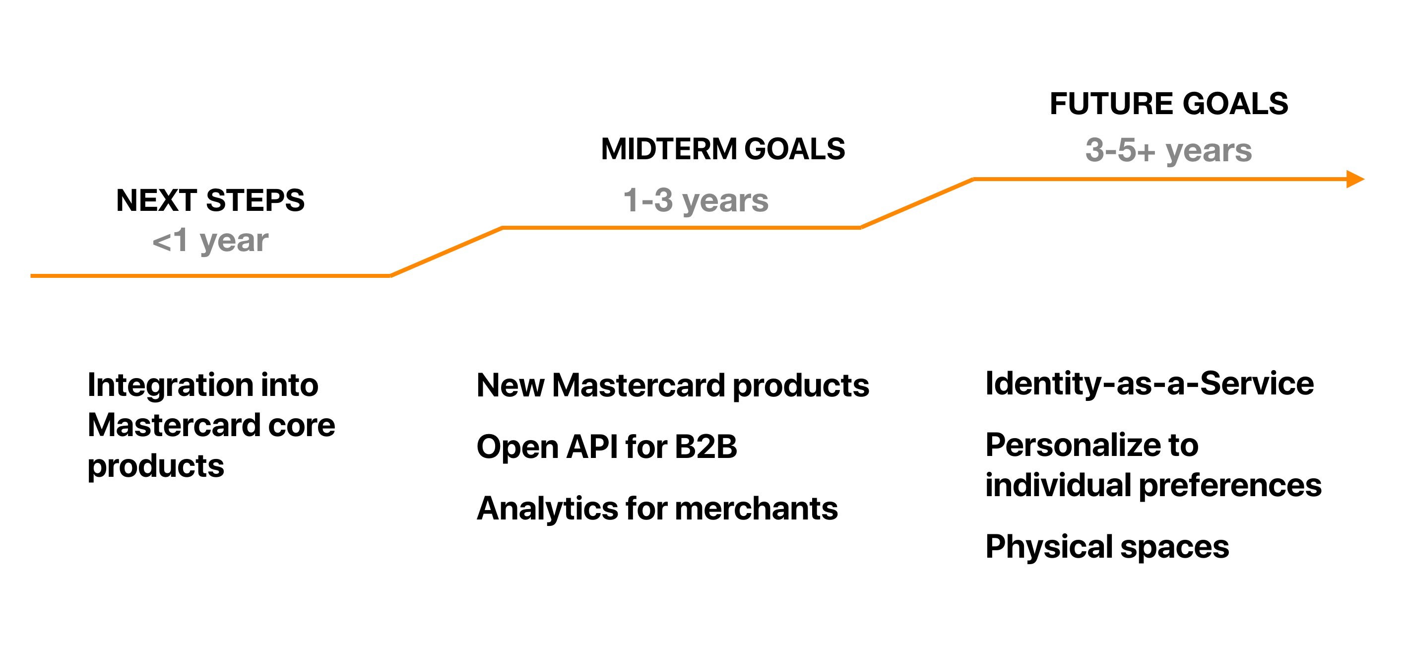
This project is sponsored by Mastercard with the goal of exploring the future of payment authentication. At the end of the 7-month we synthesized all research and findings to create a UX Guideline for using Continuous Authentication for Mastercard designers or anyone interested in adopting the technology. Here is the link to the UX Guideline website.

My role as a design lead is to lead the team’s prototyping and testing efforts.
Interested in our journey? Check out our
blog
.
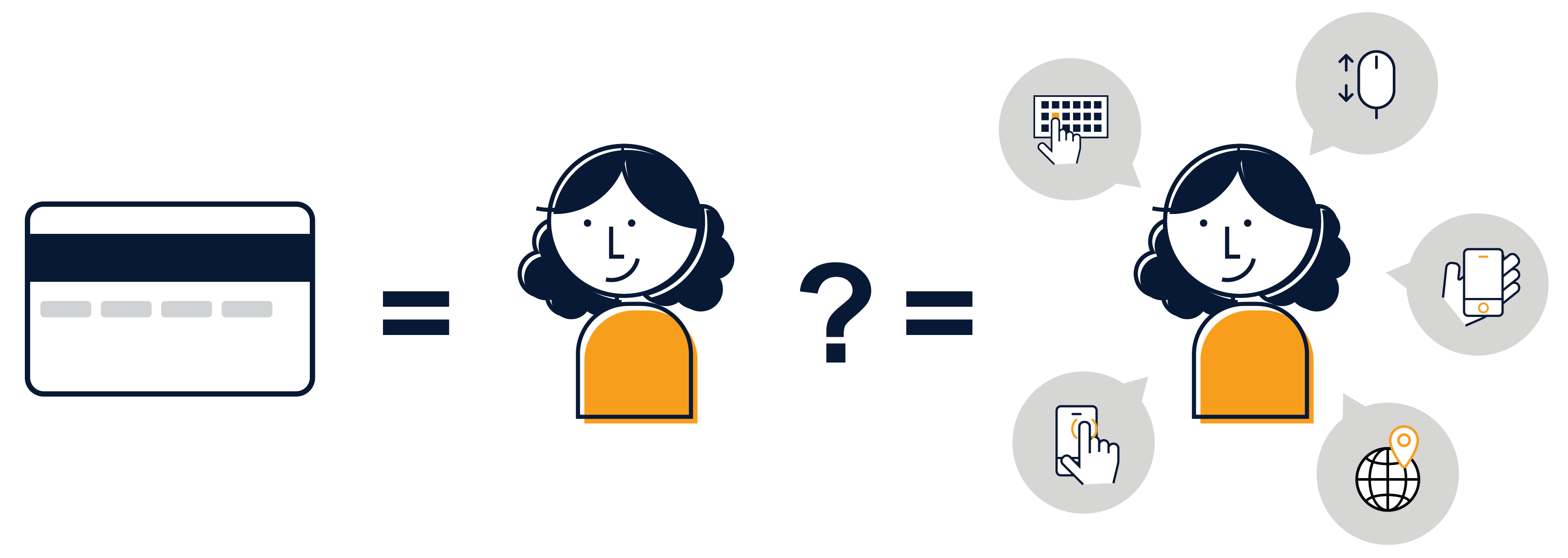
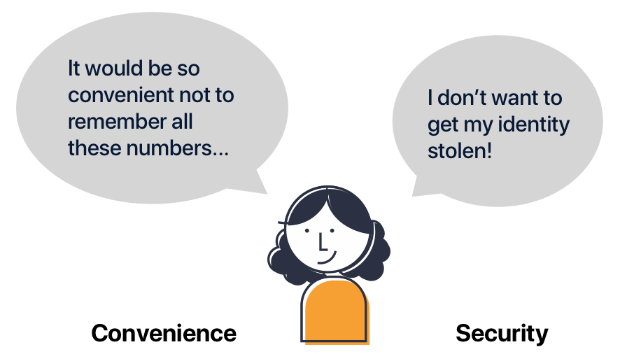
Complex password, security questions, two-factor authentication… Technologies that make us more secure are also generally inconvenient. This is because current authentication technology requires active input from the users to verify their identity. What if we can be verified by the things we are already doing at any moment?
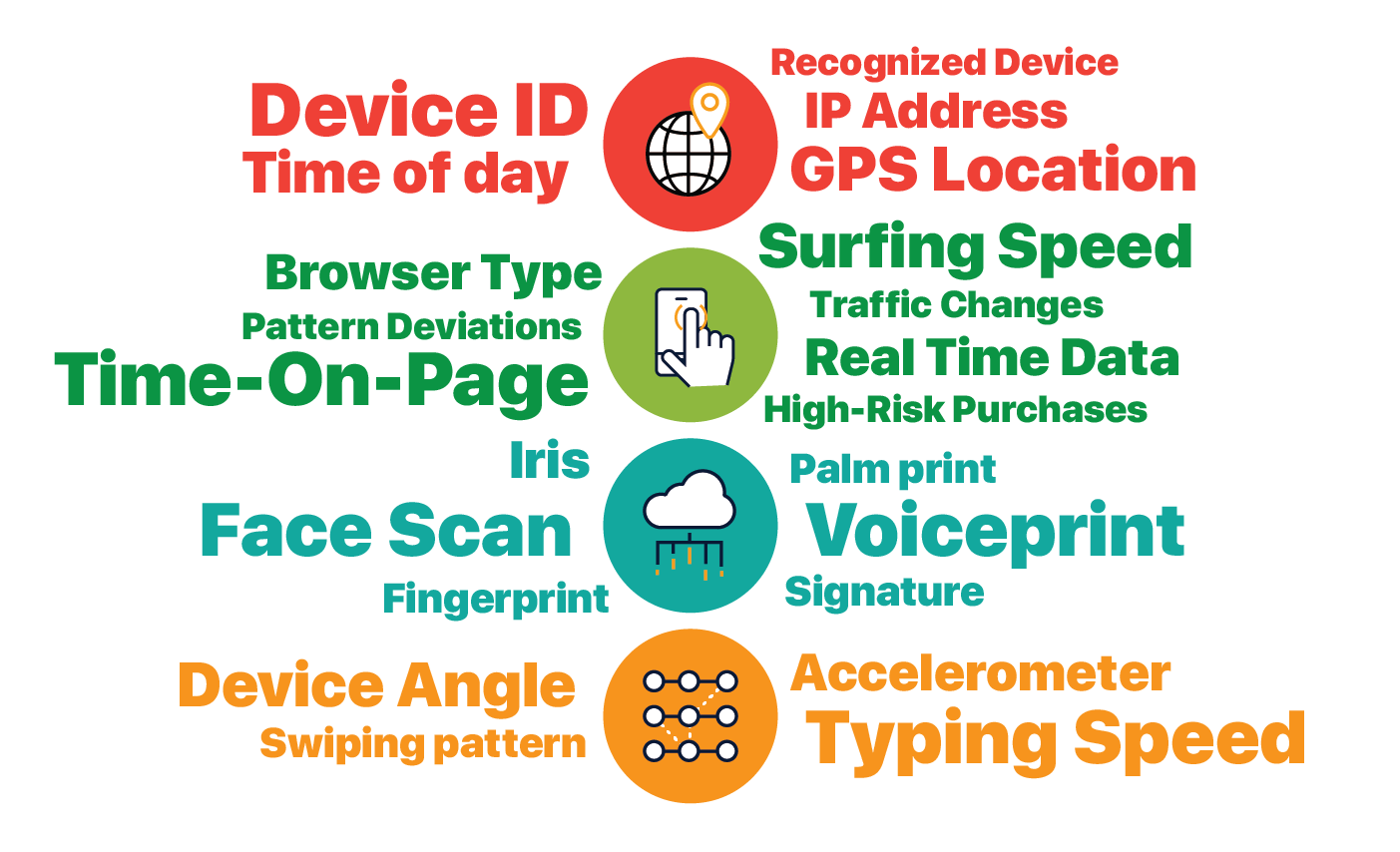
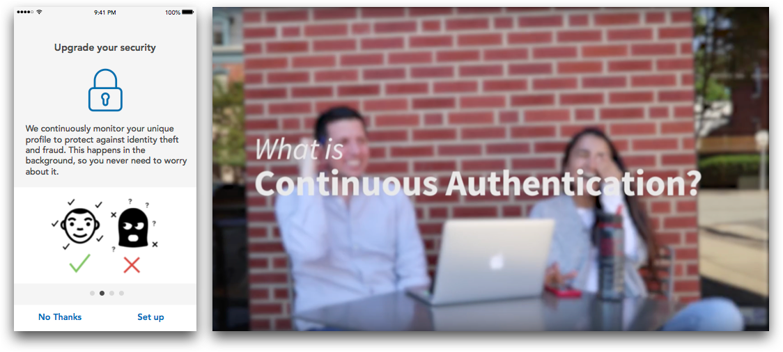
We define Continuous Authentication as "a system that verifies who you are, whenever you need it, without you thinking about it." It uses machine learning and massive amounts of data, to notice patterns in card use in aggregate as well as behaviors unique to individuals.
Since data is being collected and verified from users’ existing activity,continuous authentication can be used without any active user input. And it is more secure than any existing authentication methods because of the massive amount of data being verified.
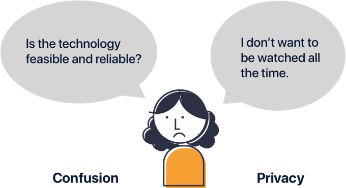
Despite the potential benefits, without a clear mental model of the new technology, people are concerned with its reliability and security. How can we design for Continuous Authentication so that it is both convenient and trust-worthy?
Let’s walk through the ideal journey using continuous authentication with our user Mia.
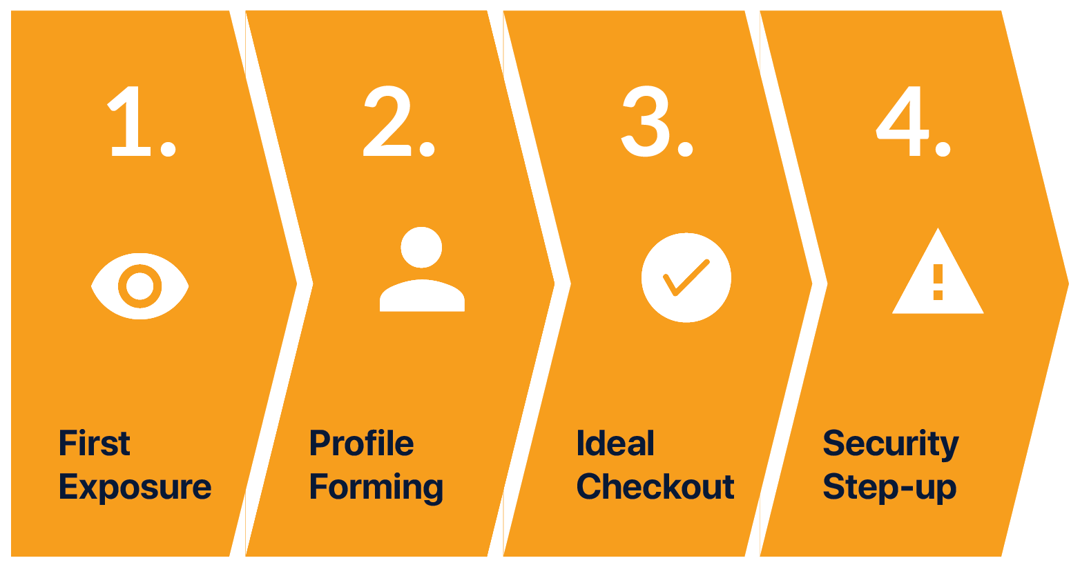
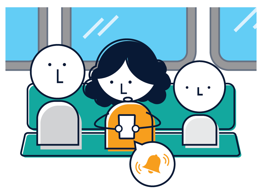
Mia is on the bus and receives a notification from her bank about a new service. Through her bank app, Mia signs up for the service, learns how it works, and gives consent to data collection.
After she has signed up, there’s a period of time where her profile is created. Mia would shop online as she normally does while the system is recording several different factors about Mia and learning her behaviors.
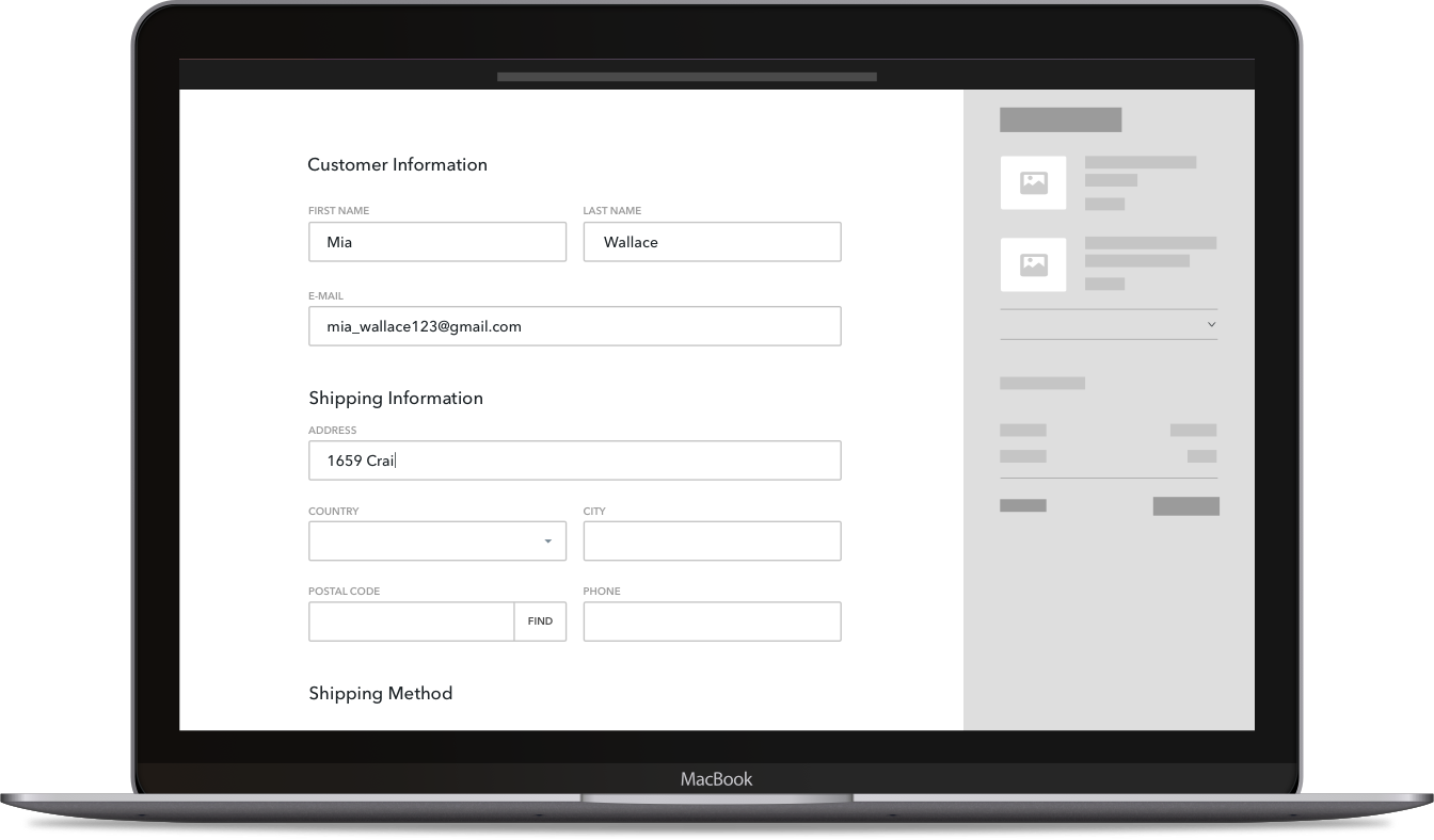
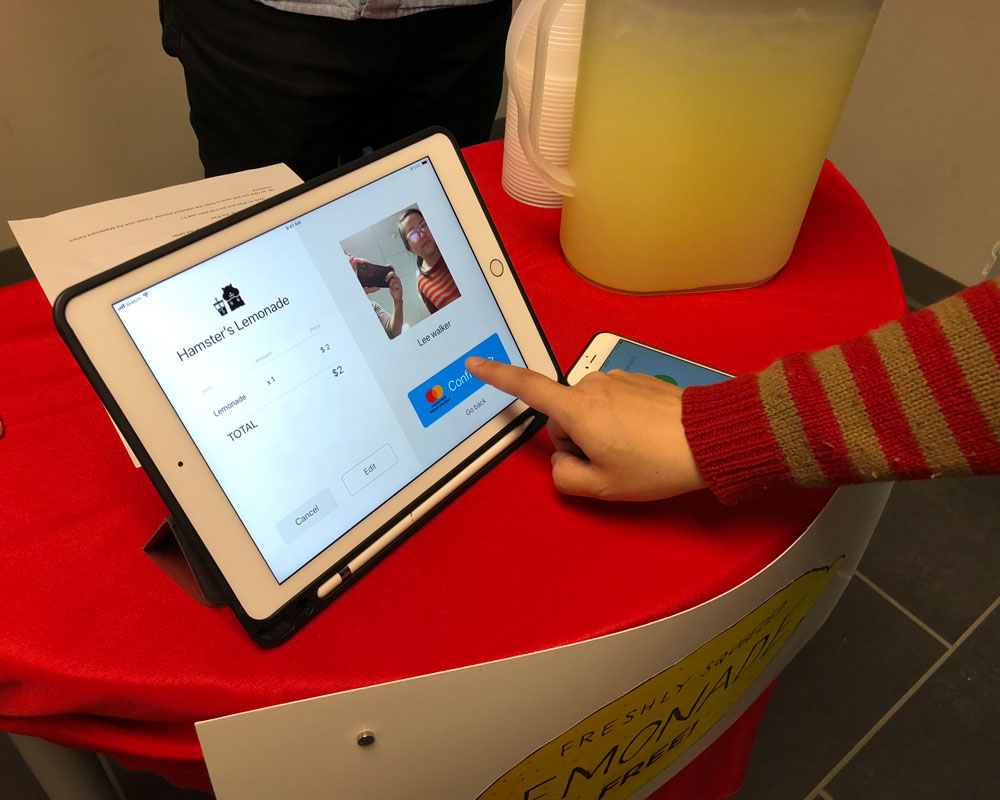
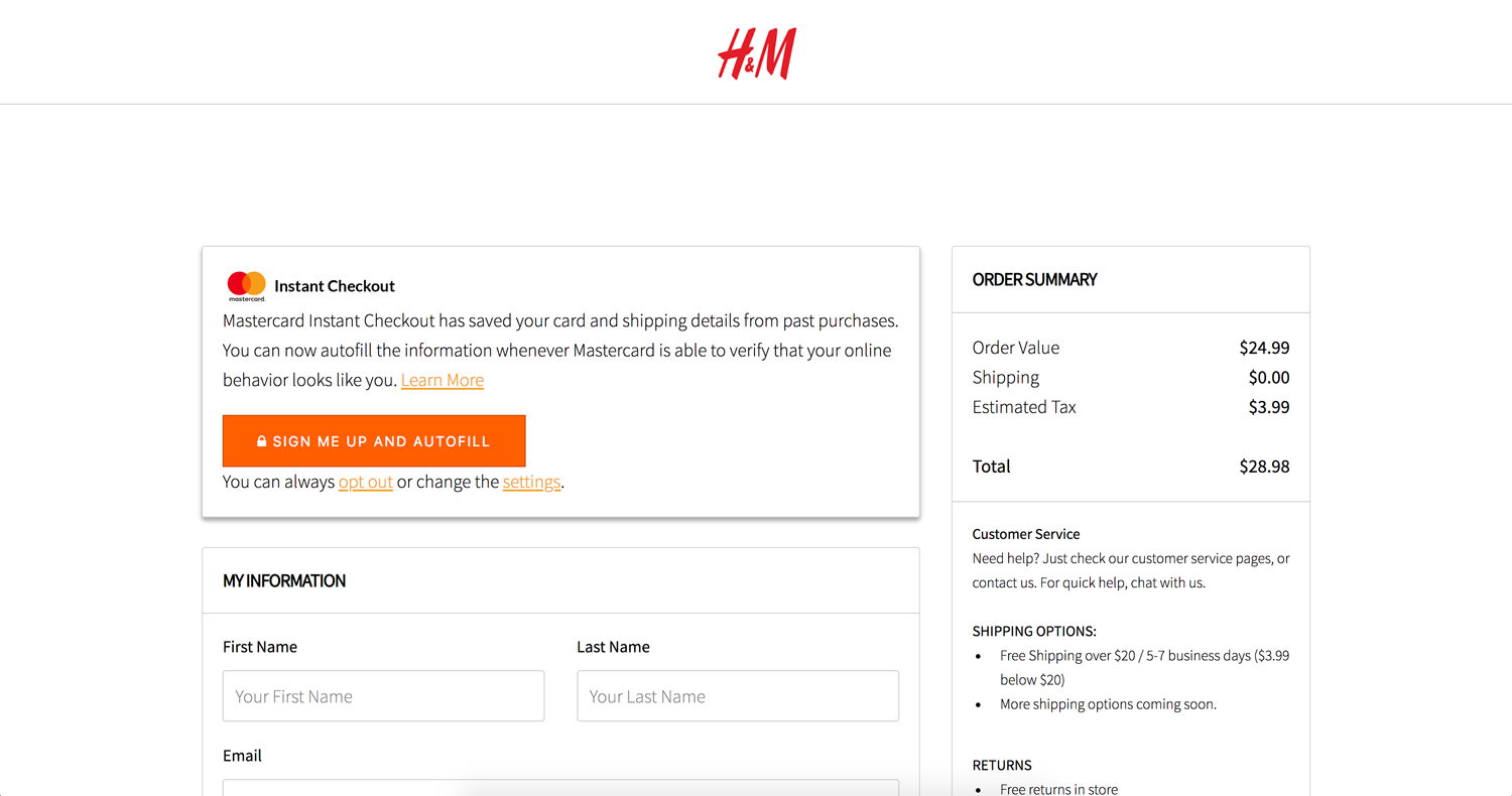
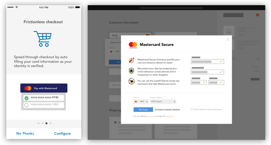
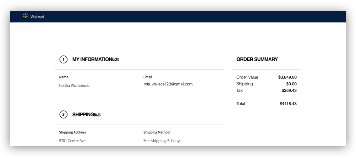
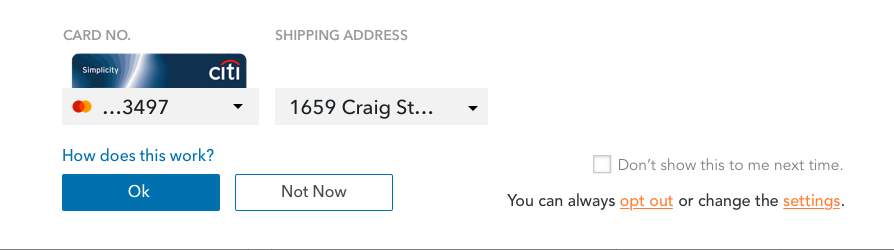
Once Mia’s profile has been fully generated, it can start working to authenticate a person quickly, easily and safely. Mia no longer needs to type up her information. The system detects it's Mia, and automatically populates all the fields for her.
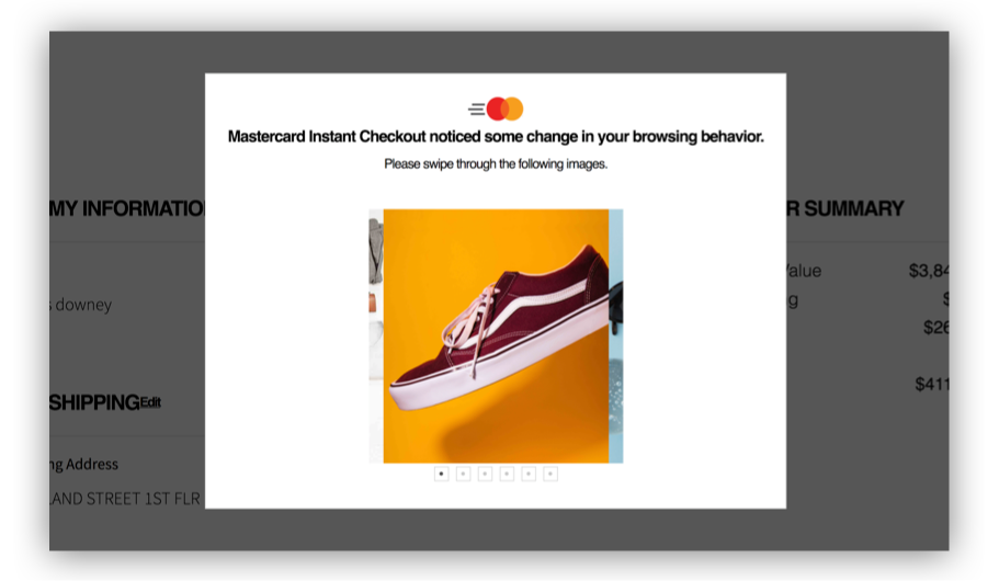
However, there will be times when the detected behaviour doesn’t match with the usual behavior of Mia, for example, if she gets hacked. The system would detect that the typing pattern and mouse movement is different from Mia and would challenge the user to verify her identity through security step-ups.
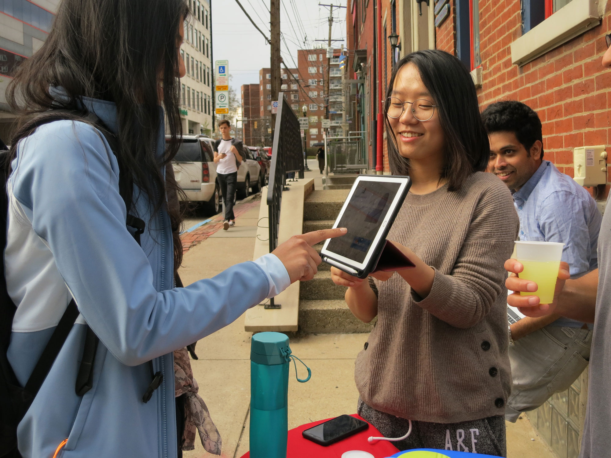
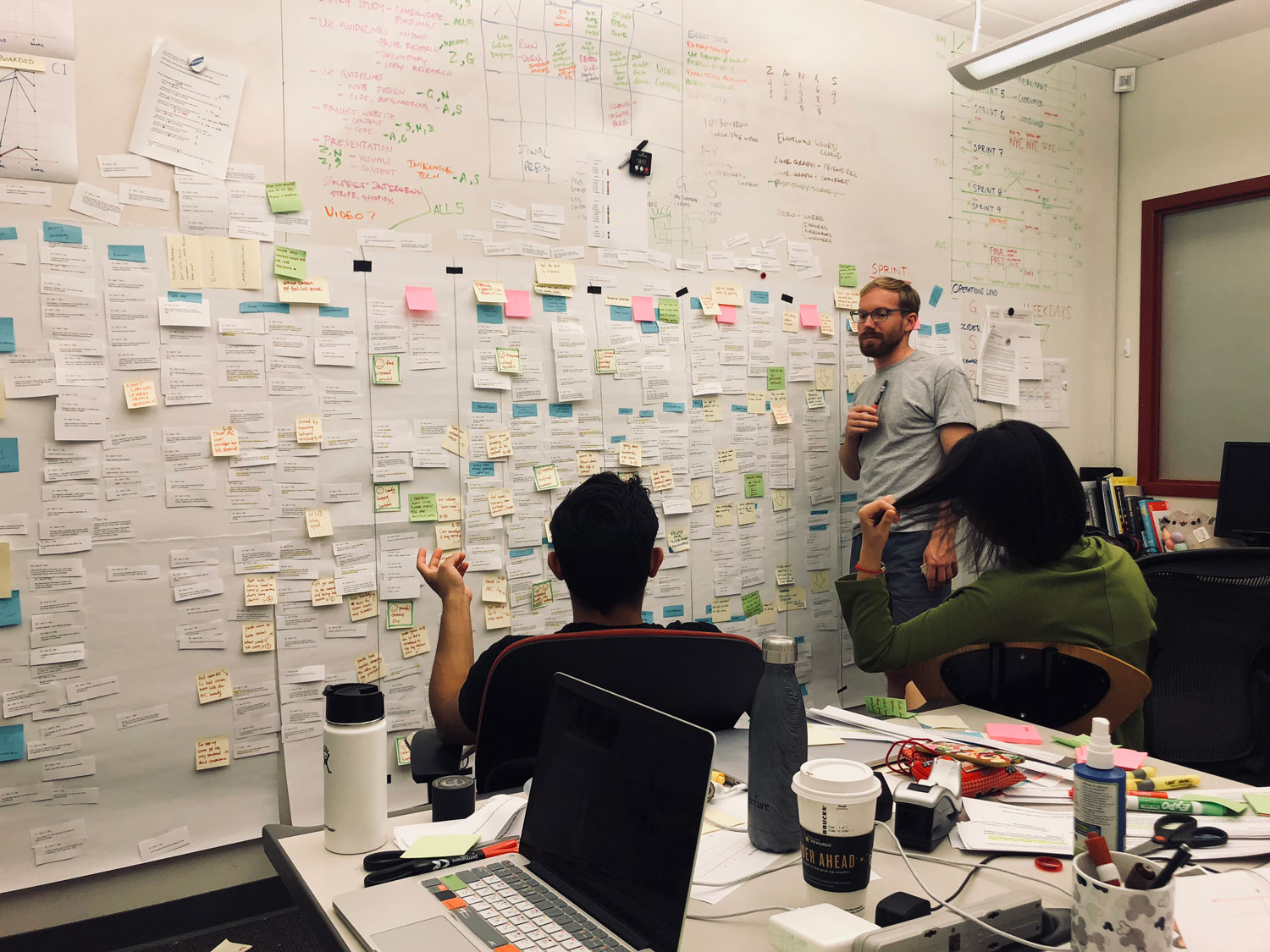
Throughout the project, we’ve been learning from a number of users ranging from regular consumers, merchants, and experts from industry or academia.

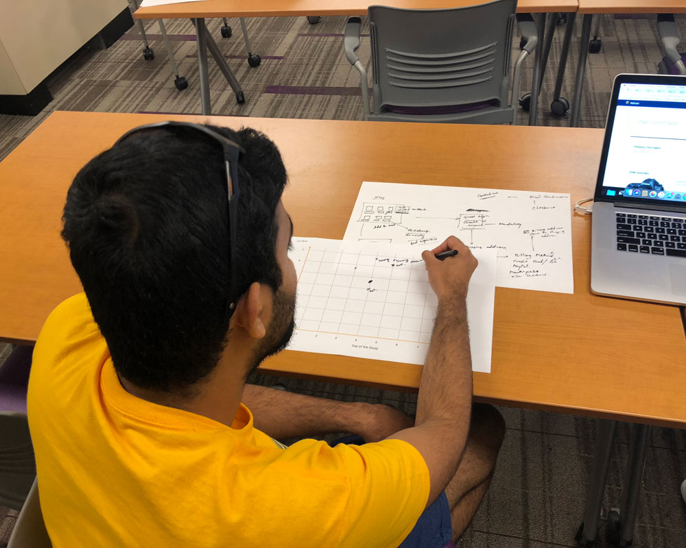
9 prototypes were created as small experiments to answer different research questions related to authentication experience. Learn more here.

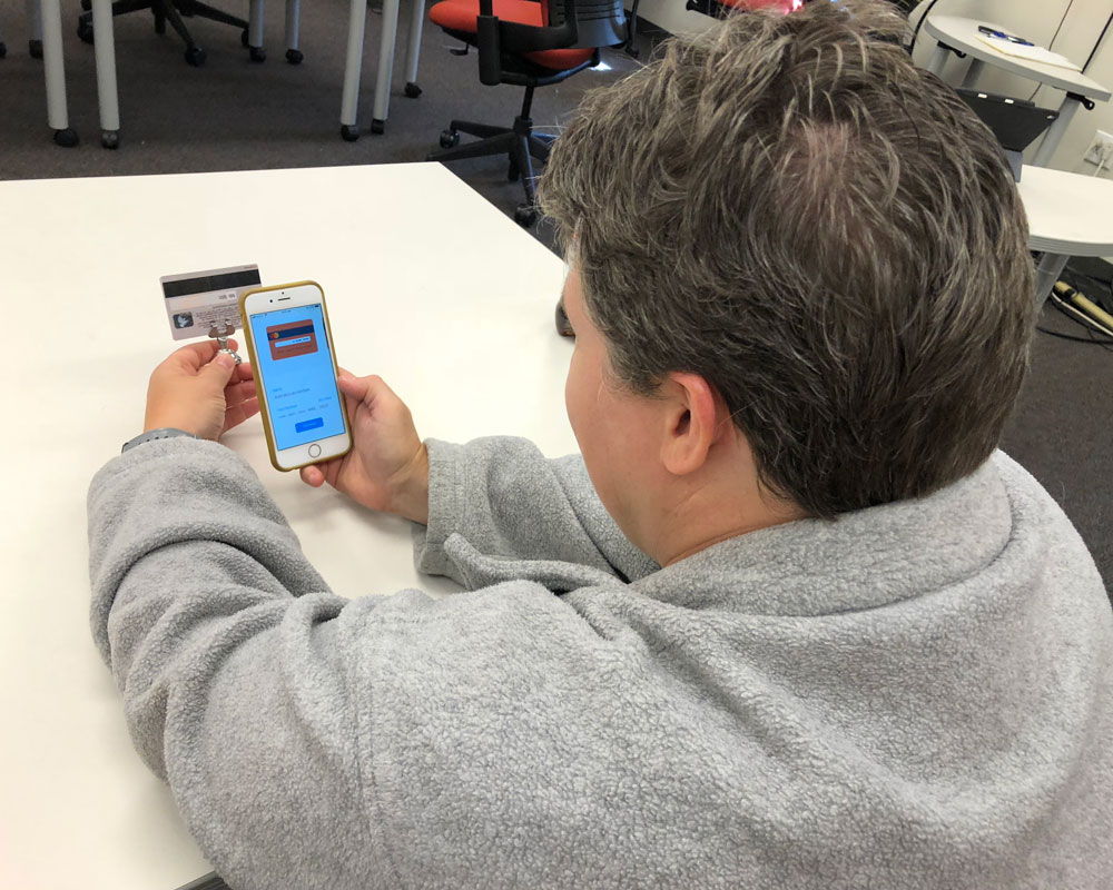
Among all the research activities, the most extensive one is a pager study with 20 participants over 8 days. We gave each participant a credit card and asked them to make purchase each day on various ecommerce websites we prototyped.
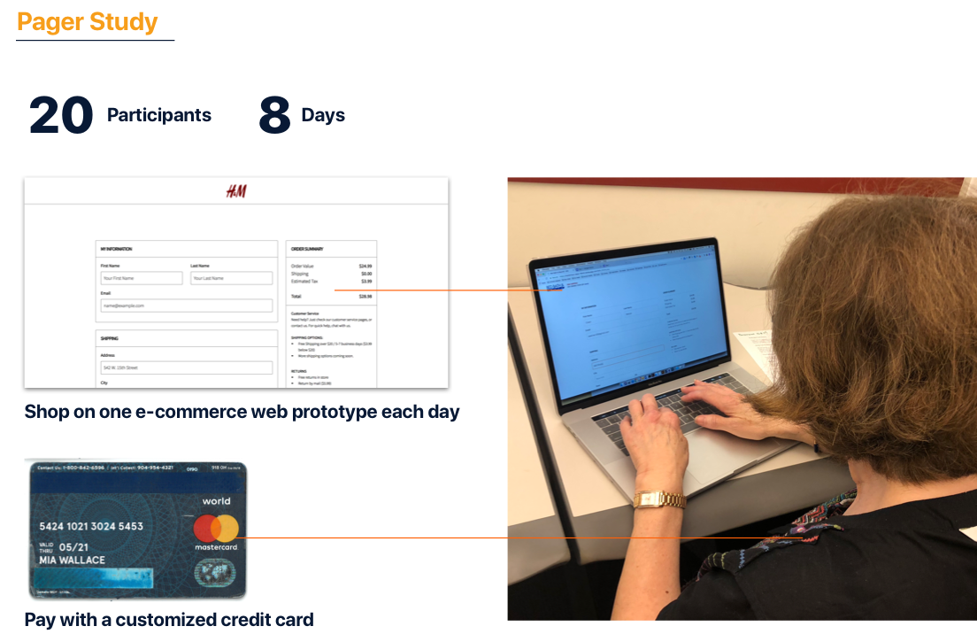
We had the participants go through the full customer journey in 8 days. We want to learn that:
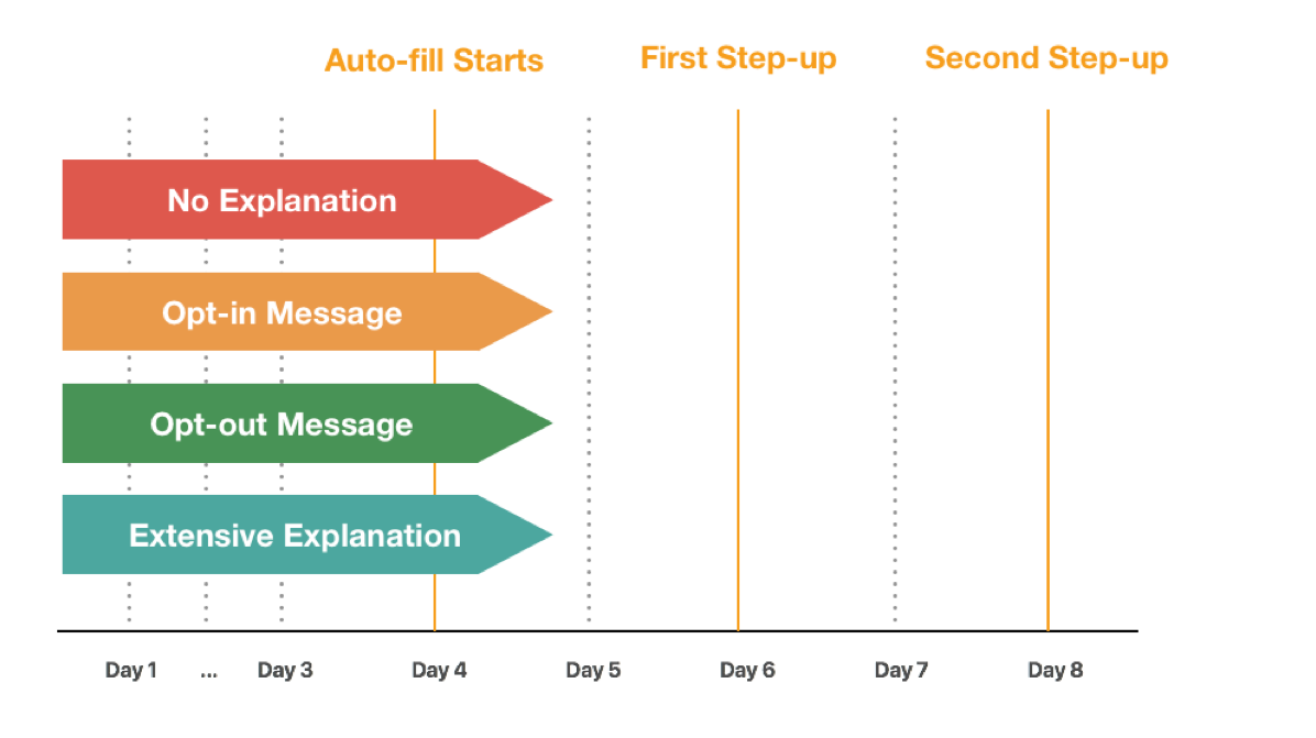
We’ve split up prototypes into 4 streams:
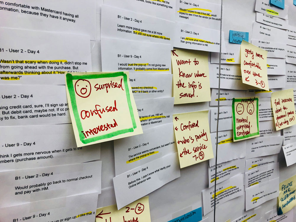
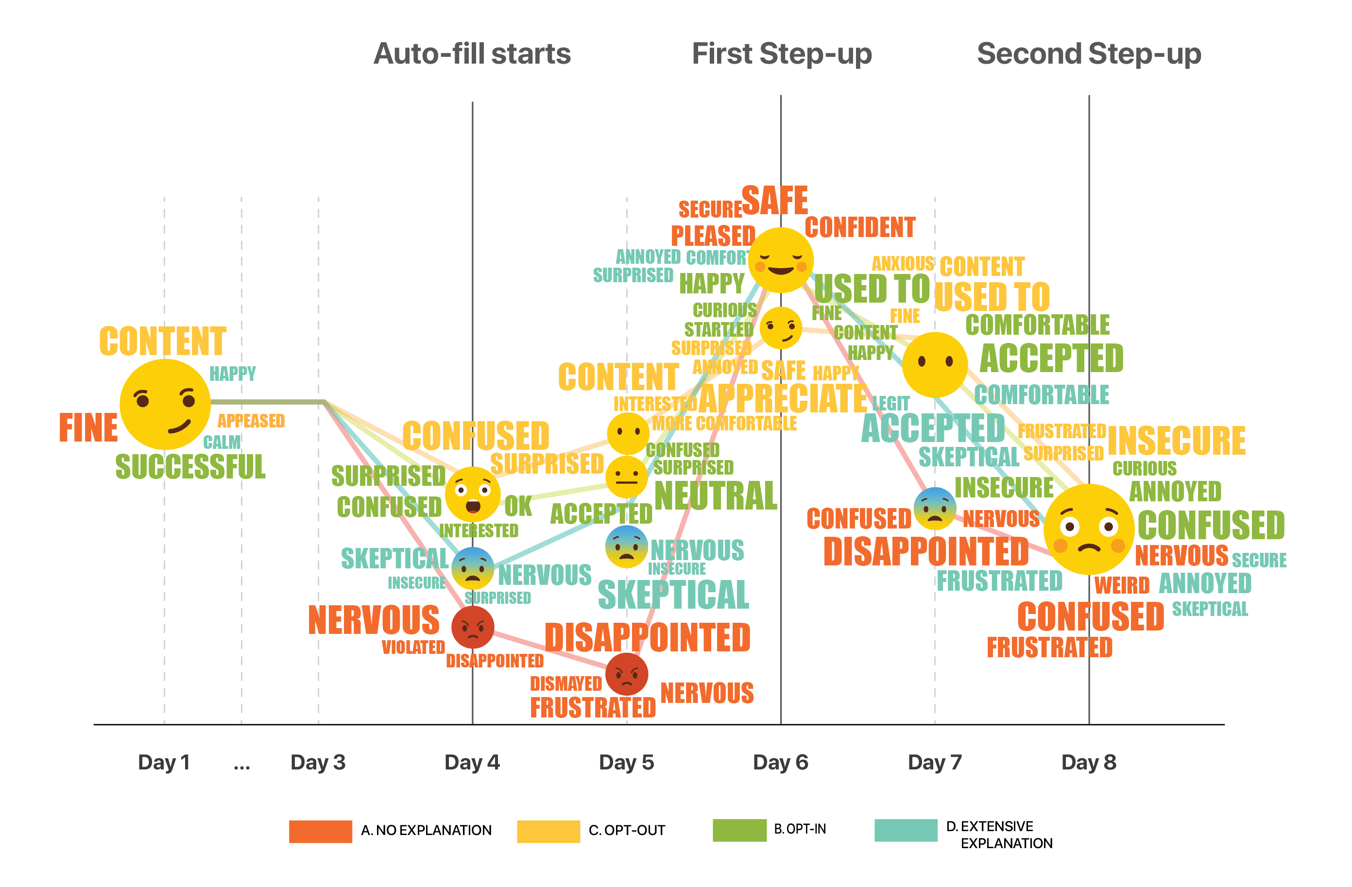
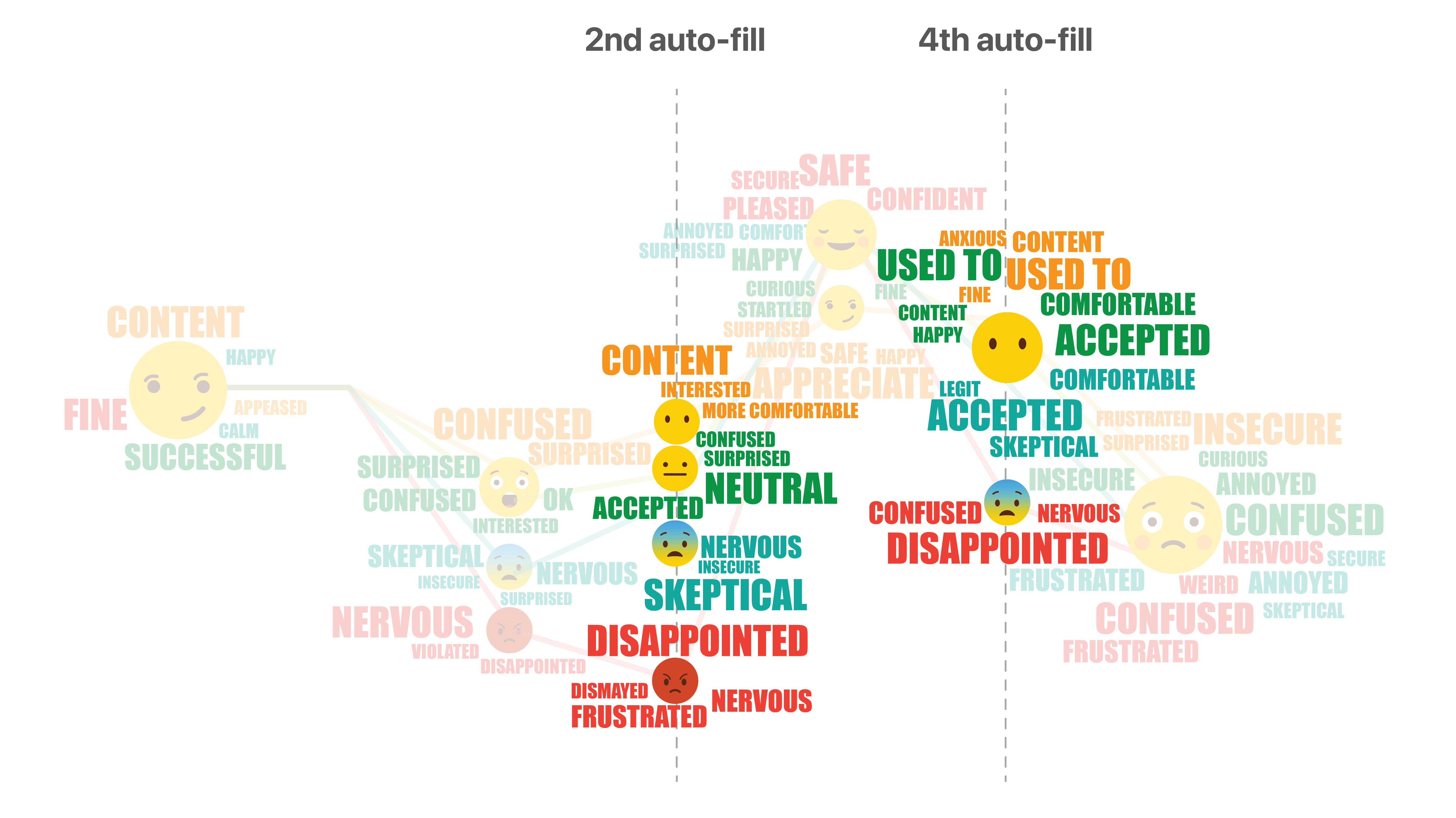
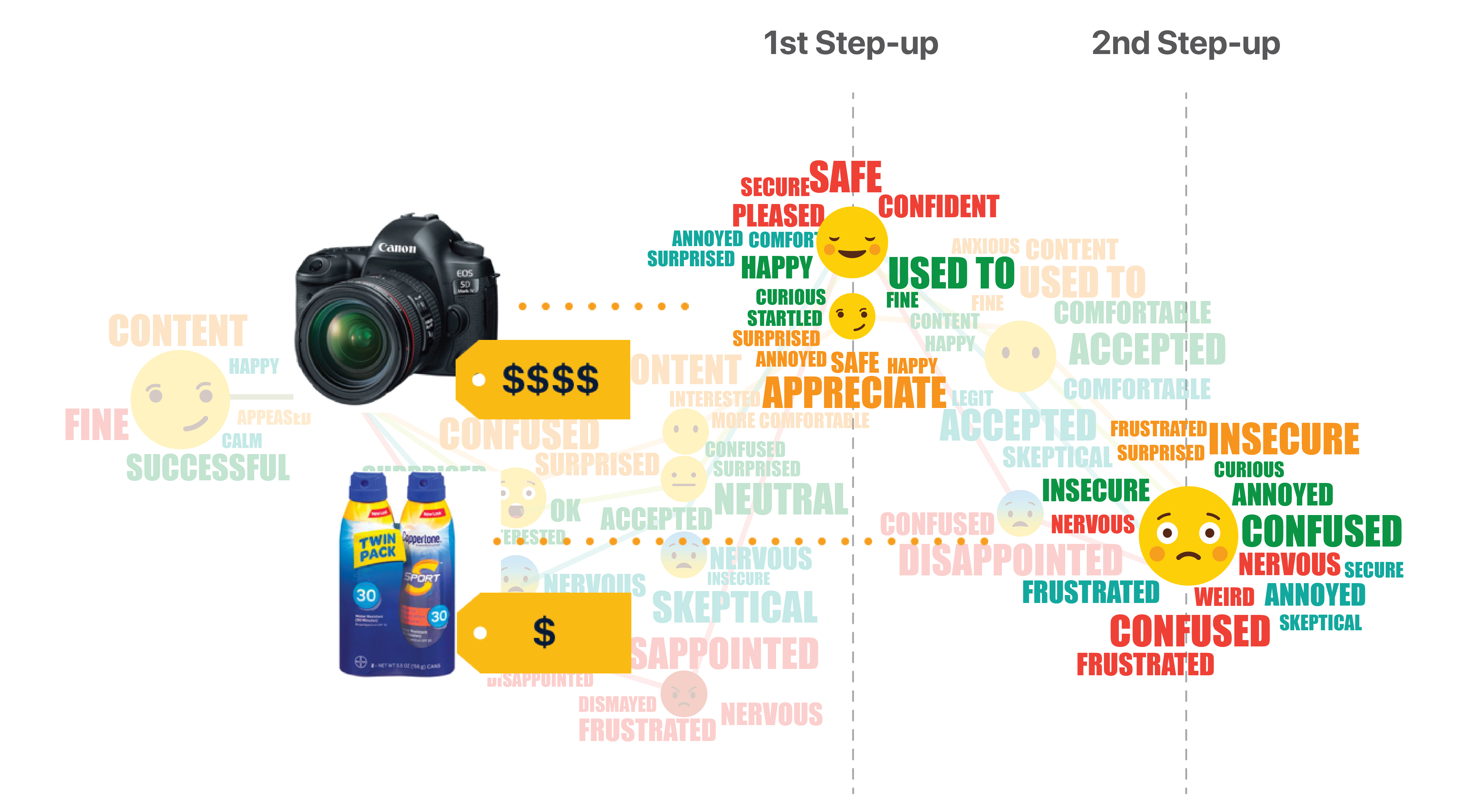
We recorded participants’ emotions for each day, and mapped them to the customer journey. This emoji word cloud shows how participants’ feelings changed on each touch point for each of the 4 streams.
Summarizing all the findings and insights, we came up with UX guidelines for using continuous authentication. Here are some of our top guidelines for each step on the customer journey.
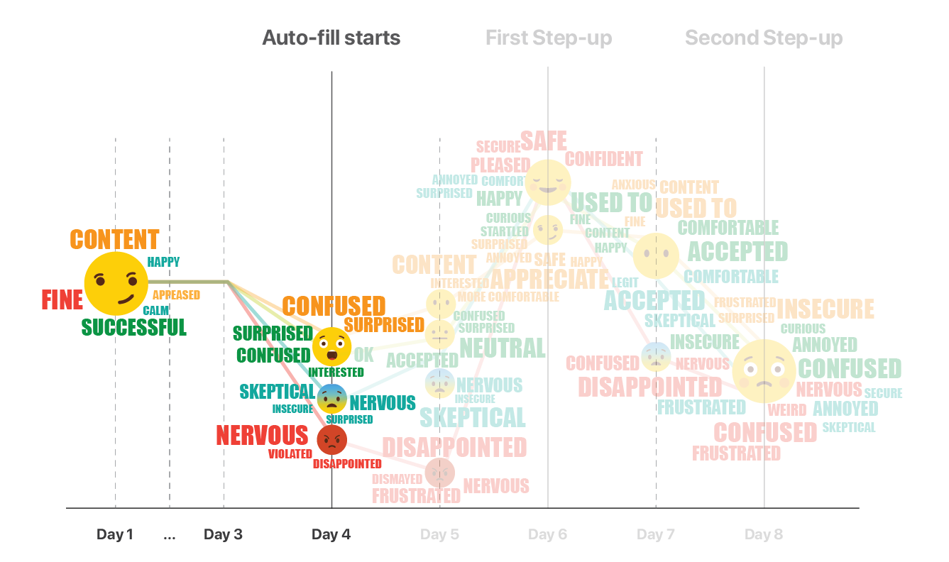
The technology is so new that people have many doubts when getting first exposed to it. Communication becomes crucial at this initial phase. A clear drop in emotions can be observed from the emoji graph when continuous authentication starts taking effect and information begins populating automatically.
In the pager study, 10 of the participants received a pop-up about the service and had choice to opt-in or opt-out during it. However, none of the participants remembered if they even clicked on the button or even saw the message.
“I don’t remember seeing this message!
“I actually don’t remember if I opted out/in or not
Five of the participants had an extensive introduction to the technology and its benefit through a video and some sign-up screens. They showed fair understanding right after the introduction, however, their overall experience or understanding wasn’t better than any other participants.
“I didn’t really connect it (the prototype) to the video honestly…
To help then users build up trust and a new mental model we need to tell and tell again. Provide the message repeatedly throughout the customer journey. Both during first exposure, and while users checking out on the merchant’s site.
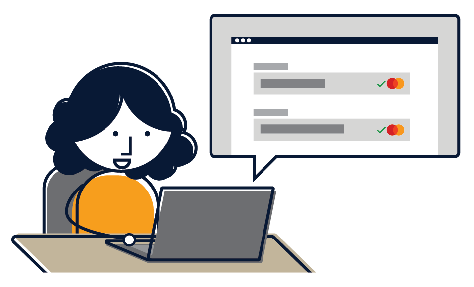
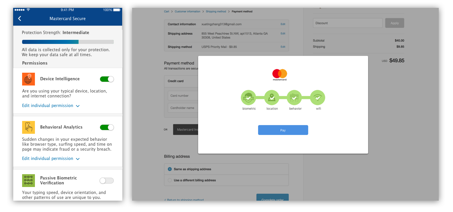
People responded very well to specific elements of the UI conveying safety and security. For example, the Mastercard logo, as well as checkmarks next to it, made people feel that they are verified and it was “very secure.”
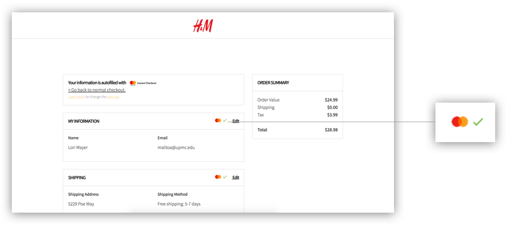
“The green check make me feel happy. It told me I’m verified. It reassures me that everything is working great.
Like UI elements, text, even if not read closely can communicate security. A “Data is Encrypted” phrase and a link to the Privacy Policy - even if it wasn’t clicked on, made people feel much more secure. And phrases such as browsing behavior makes people feel more nervous than simply saying “data”.
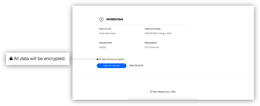
“When my data is autofilled I feel nervous, but then it says ‘Encrypted’ and I feel safe again.
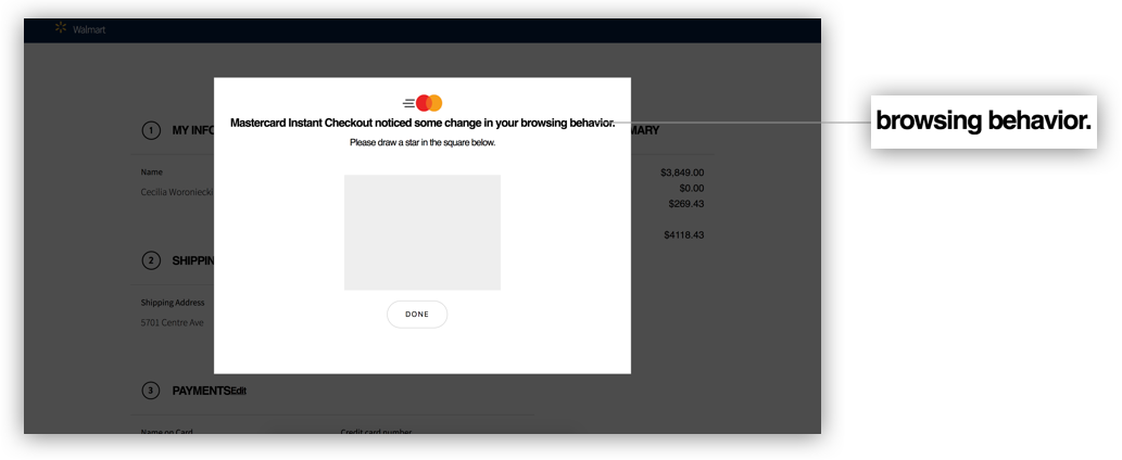
“I’d be happy that you’re being protective, but tracking my behavior? To heck with you!
Rules are different in different markets.
GDPR is possibly the most restrictive data privacy legislation globally and certainly has required a large effort on all technology companies to change their policies regarding data collection, storage, and policy communication.
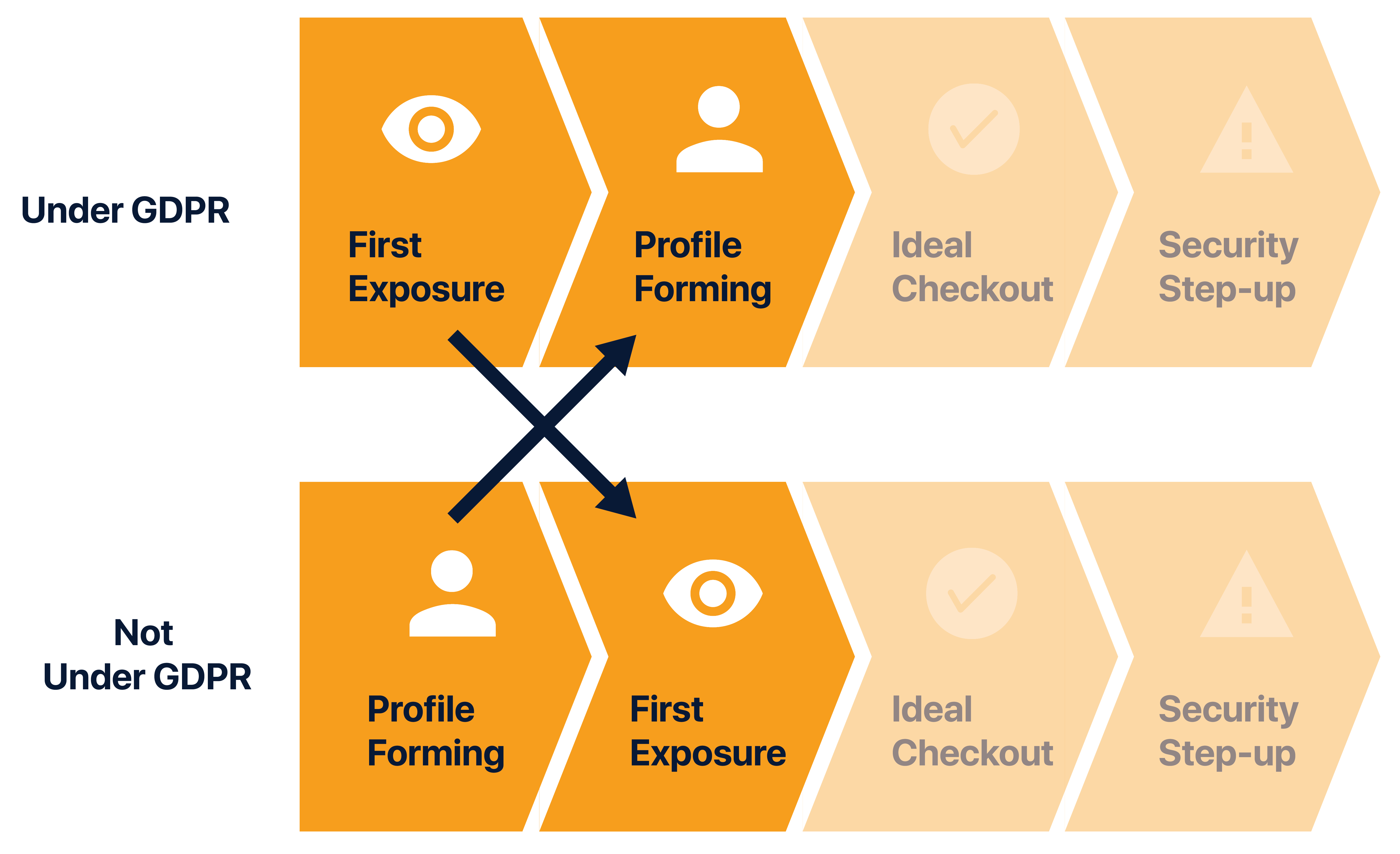
In our Pager Study we simulated streams in a GDPR and non-GDPR context. The GDPR sequence requires much more granular consent and permissions from the user before data is collected for profile creation, and the non-GDPR steam have their profile built without giving consent.
Despite the legal constraint, we found that users demanded a sense of control but only to a certain level.
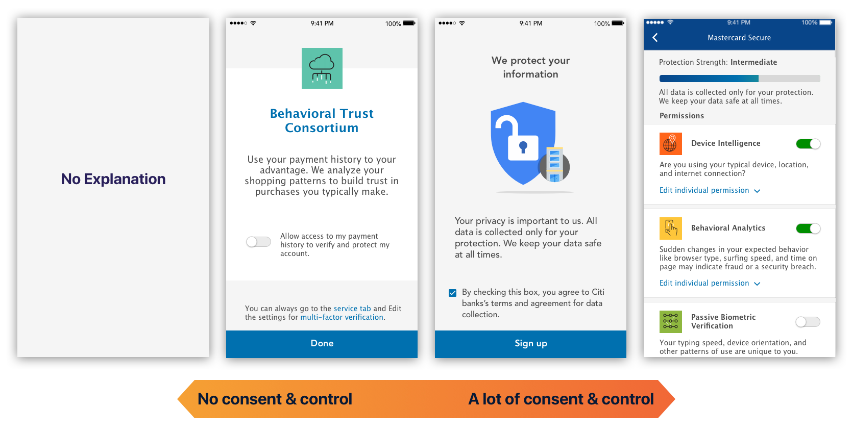
We tested prototypes ranging from giving no consent or control to giving control over every single type of data.
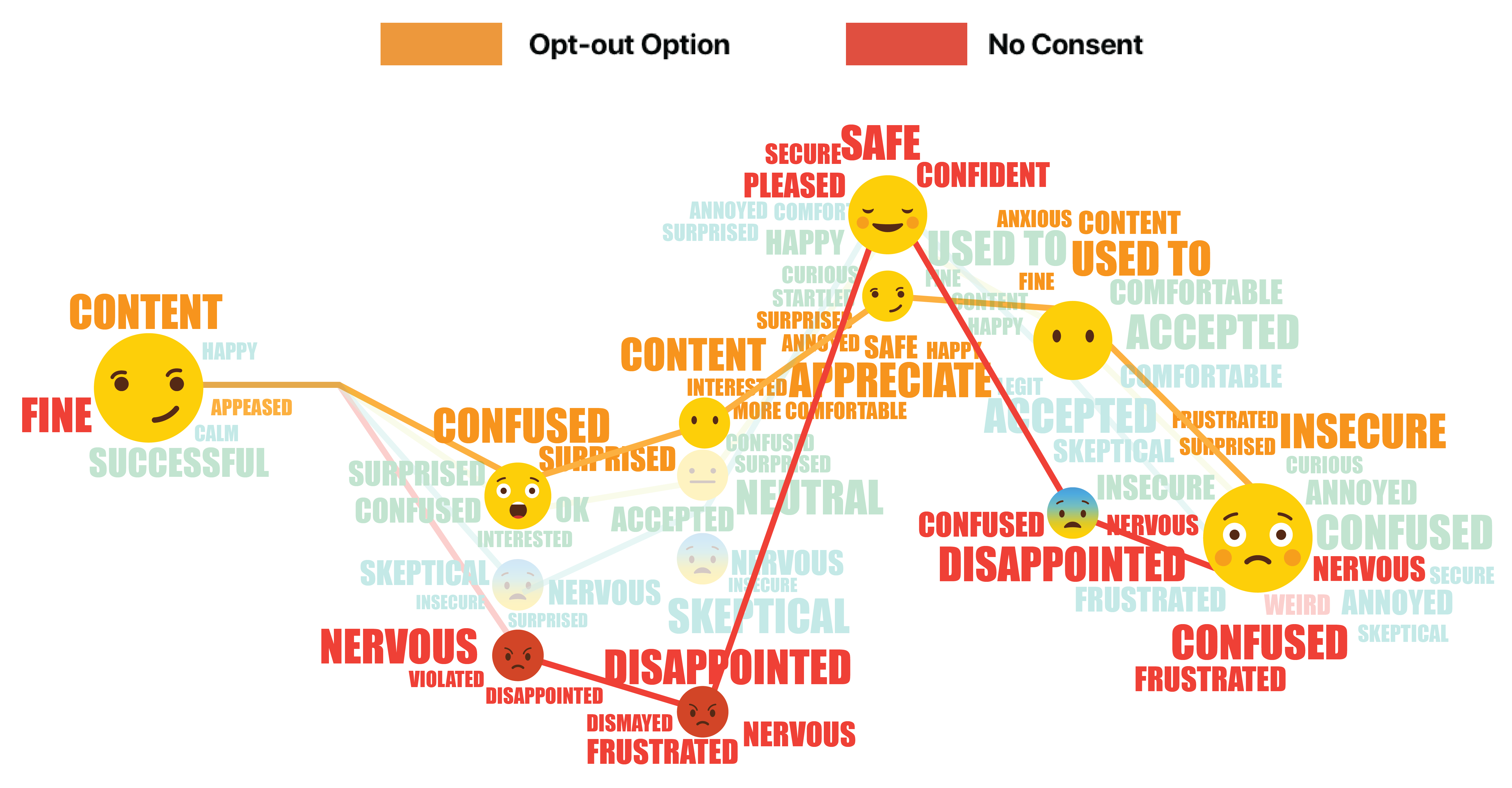
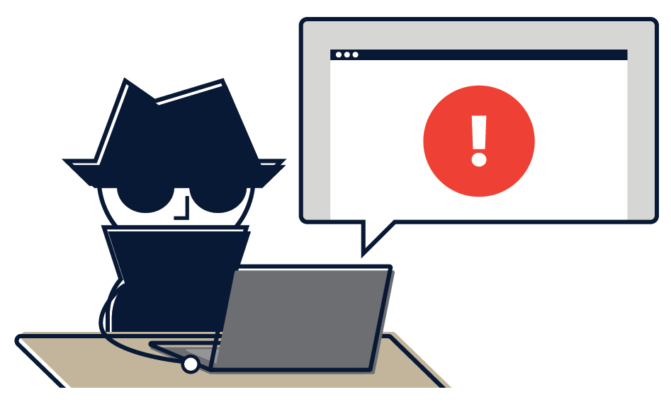
People who have no consent or control over the system expressed some extreme emotions: they feel frustrated, disappointed, or even violated. The participants given the option to opt-out, although felt confused and surprised at first had generally more positive reaction.
“I thought this was a little aggressive, Mastercard you never asked me, I never gave consent and they just did it for me
Most people found it aggressive to have their information auto-filled without consent.
Yet, people found having all that information overwhelming. Although aware of the data collection, they don’t want to be reminded every time of how much data they are giving up.
There will always be initial discomfort. But A consistently quick experience helps establish trust.
“It got easier, I surprised myself that I prefer automation so much.
“It’s a little creepy, but I’d use it. I forget my wallet all the time…
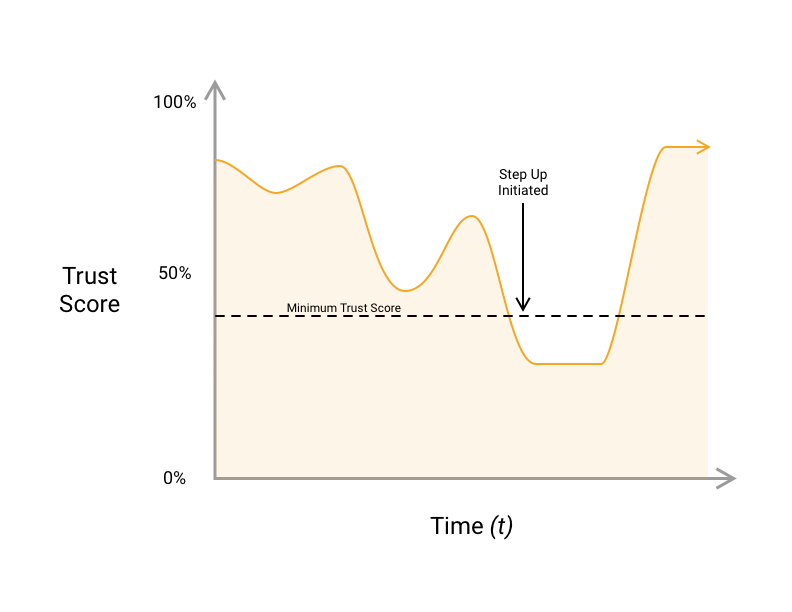
Throughout the course of normal use, a user's trust score will periodically fall below an acceptable level for authentication. If they are trying to log in or authenticate during a checkout, they will be prompted to provide more data to authenticate with. This prompt is called a step up.
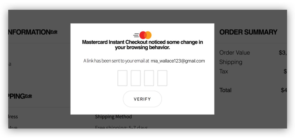
“(On email step-up) “It noticed the change. (I) feel even better about the process.”
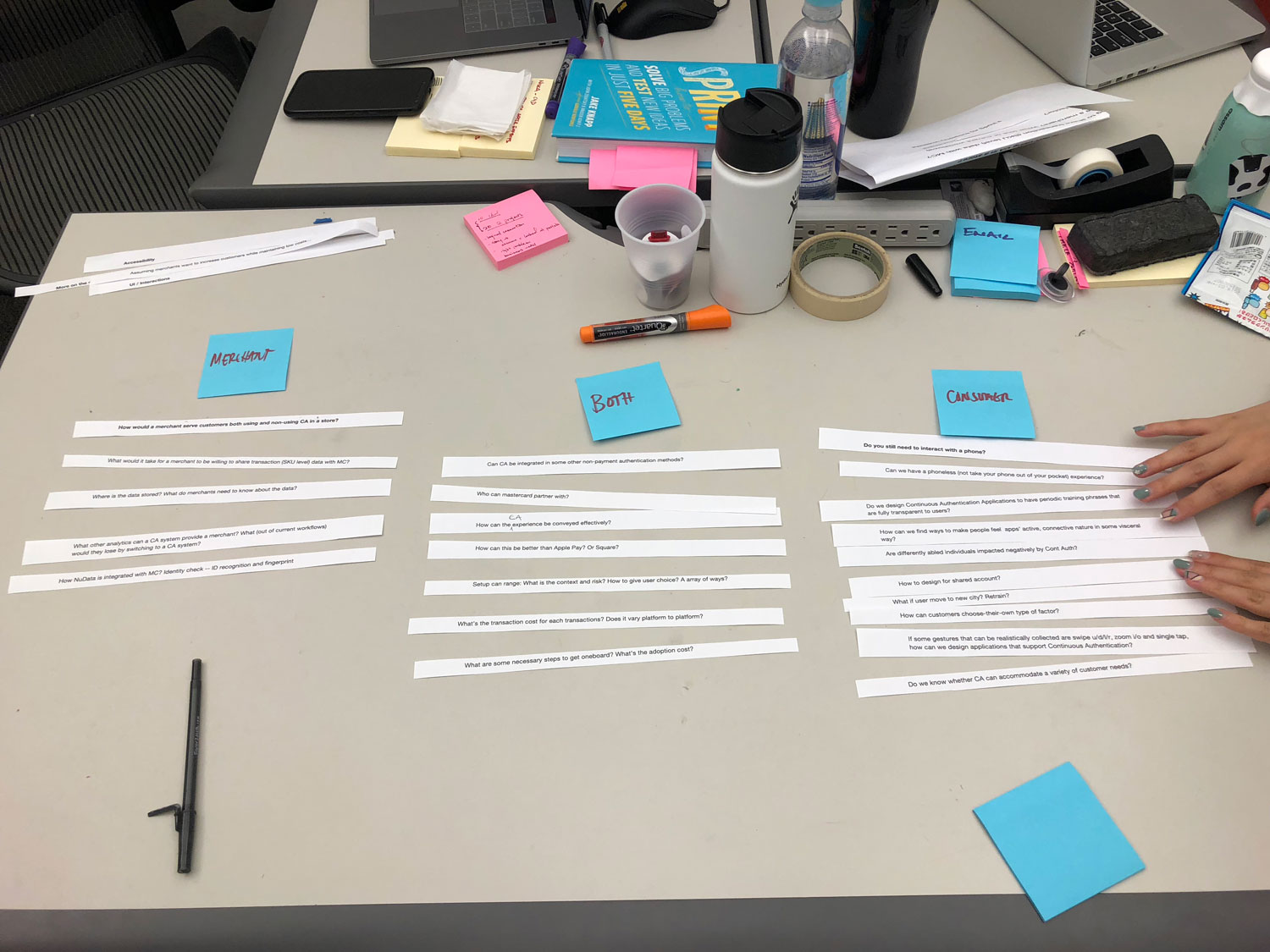
We started the project exploring a wide range of topics. However, after many discussions with clients we ended up choosing designing for continuous Authentication for the following reasons:


ThThe UX guideline website functions as a reference resource for Mastercard designers as they integrate the technology into future products.